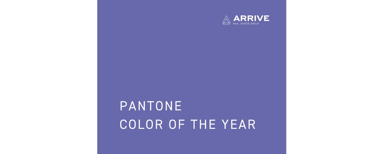
It started in 2000 and over 20 years later, Pantone is still selecting their annual Color of the Year. So what color did they choose? Drum roll please… The new Color of the Year is PANTONE 17-3938 Very Peri! For the first time, Pantone created a brand new color to be the Color of the Year. Very Peri was created by the desire to overcome the COVID-19 pandemic, environmental concerns and flaws within our current social structures.
Very Peri is a blend of blue, representing faithfulness and constancy with a bit of red, representing energy and excitement. The result was an unexpectedly warm blue hue that communicates innovation and a fresh start. Time Magazine notes that “blue light is the element most often associated with technology and futurism in the visual culture of science fiction, not to mention our daily interactions with smartphones and computers, it comes as no surprise that Very Peri was selected to represent a time when our real and online lives are so prominently converging.” Here’s a little more about the history of the Color of the Year.
Who Selects the Color Of The Year?
According to Pantone, twice a year a secret meeting of representatives from various nations’ color standards groups in Europe. After two days of presentations and debate, they choose a color for the following year.
How Is The Color Selected?
Do they close their eyes and point to the page, randomly select a number or through darts at the wall? Nope! There is a lot of time and thought that goes into selecting the Color of the Year. Pantone’s color experts search worldwide for a color that encapsulates the year. The process includes a close examination of the entertainment industry, art collections, fashion, travel destinations, lifestyles and even socio-economic conditions. Even social media, upcoming events, technology and textiles can play apart in influencing the decision.
Past Color of the Year Winners
2020 – PANTONE 19-4052 Classic Blue
2019 – PANTONE 16-1546 Living Coral
2018 – PANTONE 18-3838 Ultra Violet
2017 – PANTONE 15-0343 Greenery
2016 – PANTONE 13-1520 Rose Quartz & PANTONE 15-3919 Serenity
2015 – PANTONE 18-1438 Marsala
2014 – PANTONE 18-3224 Radiant Orchid
2013 – PANTONE 17-5641 Emerald
2012 – PANTONE 17-1463 Tangerine Tango
2011 – PANTONE 18-2120 Honeysuckle
2010 – PANTONE 15-5519 Turquoise
Does Very Peri Excite You?
The creation of a new color represents hope for the new year. How will you use Very Peri? Update your throw pillows, new artwork to hang or perhaps a bold accent wall. We must say, Very Peri looks quite similar to one of our Arrive colors! We are hoping that’s a sign for great things to come for Arrive Real Estate Group in 2022.
Contact us today to learn how we can help make your real estate dreams come true.